
How to Create Visual Balance in Your Home Decor
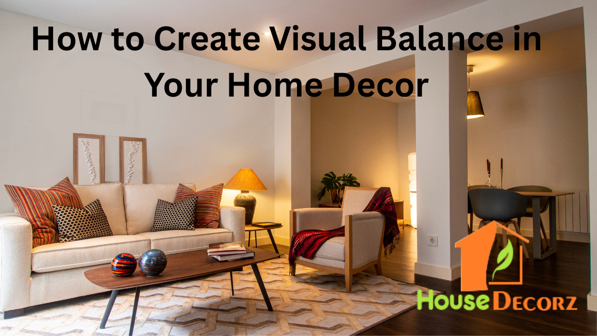
Creating a well-decorated home isn’t just about picking trendy furniture or stylish accessories—it’s about creating a space that feels right. One of the most important yet often overlooked principles in design is visual balance.
Knowing how to create visual balance in decor can completely transform a room, making it feel more harmonious, functional, and aesthetically pleasing.
Whether you’re decorating a living room, bedroom, or even a hallway, understanding the fundamentals of interior design balance will help you make more intentional choices and avoid design mistakes that disrupt the flow of your space.
What Is Visual Balance in Interior Design?
Visual balance refers to the distribution of visual weight in a room. It ensures that no area feels too heavy or too empty, creating a space that feels stable and unified. Visual weight is determined by factors like color, size, texture, and placement of objects.
Imagine walking into a room where one side is filled with large, dark furniture while the other side is bare. It likely feels off—even if you can’t immediately identify why. That’s visual imbalance.
The Three Types of Balance in Home Styling
To achieve balance in your interiors, it’s helpful to understand the three primary types:
1. Symmetrical Balance
Also known as formal balance, this approach involves mirroring design elements on either side of a central point—like two matching lamps flanking a sofa. It’s classic, structured, and works well in traditional settings.
2. Asymmetrical Balance
This more dynamic form uses different objects that have similar visual weight to create balance without being identical. For instance, a tall plant on one side of a couch can be balanced by two smaller framed prints on the opposite wall.
3. Radial Balance
Radial balance centers around a focal point, with elements radiating outward—such as a chandelier in the middle of a round dining table. It’s visually engaging and perfect for open-concept layouts or circular rooms.
Use Color and Texture Strategically
Color and texture have a strong impact on how your eyes perceive weight in a space. Dark colors typically feel heavier than light ones, and textured items draw more attention than smooth surfaces.
Home styling rule:
If you have a bold, dark-colored piece of furniture on one side of the room, offset it with a gallery wall, plant, or rug with similar visual interest on the other.
Soft textures like wool, linen, and boucle can also balance harder materials like metal or stone.
Balance Furniture Proportions
A common mistake in interior design is combining oversized furniture with much smaller pieces, which creates a lopsided feel. If you have a large sectional sofa, balance it with a sizeable coffee table or multiple armchairs rather than one tiny accent chair.
Pro tip:
Group smaller pieces together to create the visual weight of a larger item. For example, two ottomans can balance out a bulky armchair.
Pay Attention to Vertical and Horizontal Balance
Visual weight doesn’t only apply side-to-side. A well-balanced room also considers vertical space. Tall elements like floor lamps, bookshelves, or hanging art can counterbalance low furniture.
Example:
A low-profile bed can be visually “lifted” by placing tall framed artwork or wall decor above the headboard.
Create Balance Through Repetition
Repeating colors, shapes, or materials throughout a space helps guide the eye and create harmony. This repetition connects different elements, even if they are not symmetrical or similar in size.
For instance:
- Repeating black metal frames in light fixtures, table legs, and wall art
- Using a consistent accent color in pillows, vases, and throws
- Choosing wood tones that appear in multiple places in a room
Recommendation
Hallway Decorating Ideas That Make a Stunning First Impression
10 Budget-Friendly Wall Decor Ideas That Look Expensive
Space-Saving Bedroom Furniture Ideas That Work
How to Style Open Kitchen Shelves Like a Pro
How to Decorate with Neutral Tones the Right Way
FAQs About Creating Visual Balance in Decor
Q: Can I still achieve visual balance with eclectic or boho styles?
A: Absolutely. Balance doesn’t mean everything has to match—it just needs to feel evenly distributed. Even in eclectic spaces, strategic layering and repetition create flow and cohesion.
Q: Is symmetrical balance outdated?
A: Not at all. Symmetrical balance is timeless and especially effective in formal or minimalist designs. The key is to use it where it makes sense for the function and feel of the room.
Q: How can I fix a room that feels “off” without starting over?
A: Try rearranging items to better distribute visual weight. Move heavier furniture away from all being on one side. Use artwork, rugs, and plants to fill negative space and restore balance.
Q: Does ceiling height affect how I balance a room?
A: Yes. High ceilings need taller elements like bookcases or vertical artwork to avoid feeling empty at the top. Low ceilings benefit from horizontal lines and low-slung furniture to maintain proportion.
Final Thoughts
Learning how to create visual balance in decor is an essential part of mastering interior design balance. It’s what makes a room feel “just right”—comfortable to be in, pleasing to the eye, and free of visual clutter.
By incorporating principles like symmetry, proportion, color strategy, and repetition, you can elevate your home styling skills and create spaces that look professionally curated.
Whether you’re redesigning a room or just adding a few finishing touches, these home styling rules ensure every element contributes to a sense of unity and peace. Because when your space feels balanced, your whole home feels better.
