
How to Decorate Your Home Using Pastel Colors
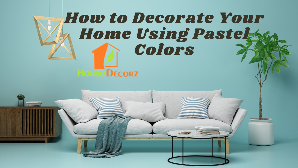
Pastel colors have quietly transitioned from nursery rooms to high-end interior design, offering a sophisticated yet soothing palette for modern homes.
If you’re wondering how to decorate with pastel colors, you’re tapping into one of the most versatile and timeless design trends available. These soft hues—like mint green, blush pink, lavender, and baby blue—create light-filled, serene interiors without overwhelming the senses.
This in-depth guide explores the fundamentals of pastel home décor, complete with historical context, expert insights, and step-by-step strategies for applying soft tone interiors throughout your living space.
Step 1: Understand the Appeal and Psychology of Pastel Colors
Pastels are essentially diluted primary and secondary colors, with white added to reduce intensity. Historically, they became popular during the Rococo period in 18th-century France and saw a resurgence during the 1950s in fashion and interiors. Today, they represent tranquility, clarity, and minimalism—perfect for contemporary living.
Color psychology insights:
- Blush pink: Associated with warmth and calm
- Powder blue: Promotes relaxation and mental clarity
- Lavender: Enhances creativity and spirituality
- Mint green: Encourages balance and freshness
Incorporating these shades into your home sets a peaceful tone and supports emotional well-being.
Step 2: Start with a Pastel Base in Walls and Large Surfaces
When working with pastel home decor, begin by selecting a foundational color for your walls. This acts as the canvas for your entire design scheme.
Tips for pastel walls:
- Choose matte or eggshell finishes for a soft, velvety effect.
- Apply pastels in open-plan areas to enhance light diffusion.
- Use two-tone pastels for subtle contrast—such as blush pink with warm gray.
If you’re not ready to commit fully, try painting just one accent wall or using pastel wallpaper with minimal patterns.
Step 3: Layer Textures and Patterns for Depth
Pastel interiors run the risk of appearing flat if not balanced with textures and patterns. Introducing tactile elements ensures the design feels complete and inviting.
Effective layering strategies:
- Pair pastel fabrics like cotton or linen with plush materials such as velvet or chenille.
- Add visual texture with woven rugs, knit throws, or tufted upholstery.
- Mix subtle patterns—think stripes, botanicals, or watercolor prints—to enhance interest without overpowering the space.
Combining soft tone interiors with layered details makes your home feel cozy yet refined.
Step 4: Mix with Neutrals or Bold Contrasts
One common mistake is overusing pastels. Balance is key. To keep your design grounded, incorporate neutrals or even contrasting bold accents.
Best combinations:
- Pastels + White/Cream: For a breezy, minimal look
- Pastels + Gray: Adds sophistication and depth
- Pastels + Black/Gold: Creates a striking, modern contrast
- Pastels + Wood Tones: Warms the palette with natural textures
Using neutrals helps pastels feel more mature, while small doses of strong color add personality.
Step 5: Accessorize Thoughtfully with Pastel Accents
If you’re looking to dip your toes into pastel home decor without repainting walls or replacing furniture, accessories are the perfect entry point.
Pastel accessories to try:
- Throw pillows in sky blue or lilac
- Ceramic vases in dusty rose or mint green
- Wall art featuring pastel abstract or floral designs
- Lampshades, candles, or area rugs in coordinating tones
Use the 60-30-10 rule: 60% base color (neutral), 30% pastel, and 10% accent to create balance.
Expert Insight
Interior stylist Vinod Gill, known for his Scandinavian-meets-vintage aesthetic, says:
“Pastels aren’t just for spring—they’re a year-round design asset. The trick is to treat them as neutrals. You can use blush pink or sage green the same way you’d use beige or gray. It’s about subtlety and layering, not kitsch.”
Recommendation
Trending Wall Paint Colour Combinations for Indian Homes in 2025
Best Curtain Colour Combinations for a Modern Home in 2025
Trending Sofa Colours 2025 – Pick the Perfect Hue for Your Space
Best Bedroom Wall Colour Combinations for 2025 – Modern Dual Tones
Frequently Asked Questions (FAQ)
Q1: Can pastel colors work in small spaces?
A1: Absolutely. Pastel tones reflect light and create an airy, open feel, making them ideal for smaller rooms or apartments.
Q2: What colors go well with pastels?
A2: Neutrals like white, beige, and gray pair beautifully. For contrast, navy, charcoal, or metallics like gold and brass add sophistication.
Q3: Are pastels suitable for every room in the house?
A3: Yes. Use calming pastels in bedrooms, refreshing mint in kitchens, and soft lavender or blue in bathrooms for a serene effect.
Q4: How do I prevent a pastel room from looking too childish?
A4: Focus on refined materials (like velvet or leather), mature patterns (like abstract art), and sophisticated accessories to elevate the look.
Final Thoughts
Learning how to decorate with pastel colors opens up a world of gentle charm and refined elegance. Whether you’re embracing soft tone interiors across your entire home or adding splashes of pastel through accessories, the key is harmony and subtlety.
With careful planning and thoughtful layering, your home can radiate a calm, cohesive, and contemporary vibe that feels effortlessly welcoming.
